This tutorial explains how to create a new design for the froxlor web panel by copying the main theme, adjusting the config.json file, and modifying the CSS.
cd /var/www/html/froxlor/templates/
cp -r Froxlor Custom
After the main theme is copied, the config.json file must be adjusted so that froxlor displays the new theme correctly in the theme selection.
cd Custom
nano config.json
It’s important to note that the description field should be changed and if the theme only supports one color mode, the dark object can be removed from the JSON.
{
        "variants": {
                "default": {
                        "img": {
                                "login": "logo.png",
                                "ui": "logo_white.png"
                        },
                        "css": [
                                "main.css",
                                "custom.css"
                        ],
                        "js": [
                                "main.js",
                                "apikey.js"
                        ],
                        "description": "Custom - Default"
                },
                "dark": {
                        "img": {
                                "login": "logo_white.png",
                                "ui": "logo_white.png"
                        },
                        "css": [
                                "dark.css",
                                "custom.css"
                        ],
                        "js": [
                                "main.js",
                                "apikey.js"
                        ],
                        "description": "Custom - Darkmode"
                }
        },
        "author": "Custom"
}
Changing CSS
The easiest way to override small parts of CSS is by using the custom.css file:
nano assets/css/custom.cssDigging deeper with custom CSS and build tools
Froxlor uses Bootstrap as CSS Framework, the file assets/css/main.css is built with mix from the src/scss/main.scss and the assets/js/main.js is also built from the src/js/main.js
To build your own assets you have to modify the webpack.mix.js to following content:
// webpack.mix.js

let mix = require('laravel-mix');

// The froxlor theme
mix
	.setPublicPath('templates/Froxlor/assets')
	.options({
		processCssUrls: false
	})
	.copyDirectory('node_modules/@fortawesome/fontawesome-free/webfonts', 'templates/Froxlor/assets/webfonts')
	.js('templates/Froxlor/src/js/main.js', 'js')
	.sass('templates/Froxlor/src/scss/main.scss', 'css')
	.sass('templates/Froxlor/src/scss/dark.scss', 'css')
        .version();

// The custom theme
mix
	.setPublicPath('templates/Custom/assets')
	.options({
		processCssUrls: false
	})
	.copyDirectory('node_modules/@fortawesome/fontawesome-free/webfonts', 'templates/Custom/assets/webfonts')
	.js('templates/Custom/src/js/main.js', 'js')
	.sass('templates/Custom/src/scss/main.scss', 'css')
	.sass('templates/Custom/src/scss/dark.scss', 'css')
	.version();
after you modify the file, you can build the assets for your theme.
Important: The webpack.mix.js file may be overwritten on every froxlor update, so keep a Backup of it.
Pro Tip: You can also remove the froxlor theme in the webpack.mix.js to get a faster built time because the froxlor theme has already been built.
Example: Changing the Primary Color
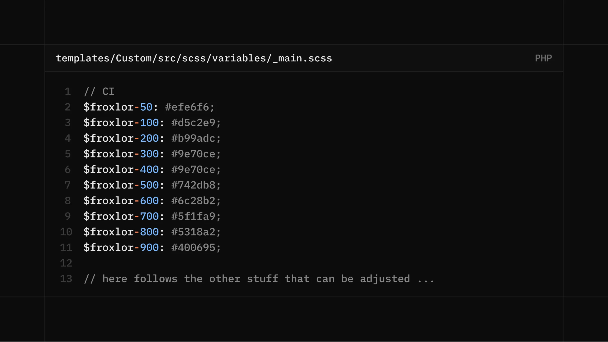
Open the _main.scss variables file:
nano templates/Custom/src/scss/variables/_main.scssUse for example the tool for picking colors on Material.io:
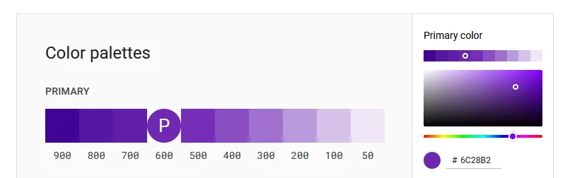
And change it accordingly in the _main.scss file (you can get the Color HEX from the tool above by clicking on the color):
// CI
$froxlor-50: #efe6f6;
$froxlor-100: #d5c2e9;
$froxlor-200: #b99adc;
$froxlor-300: #9e70ce;
$froxlor-400: #9e70ce;
$froxlor-500: #742db8;
$froxlor-600: #6c28b2;
$froxlor-700: #5f1fa9;
$froxlor-800: #5318a2;
$froxlor-900: #400695;

// here follows the other stuff that can be adjusted ...
Take a look into the Bootstrap Documentation for more options.
If you’re done with your change, build your theme with:
npm run buildNotice: remember to install NPM and run npm install first.
You can also run the following command to continuously watch for changes in the src folder:
npm run devAfter we build our new theme our navigation, buttons and notifications got a new color:
